Toolbars
Toolbars
Overview
New in 3.5 is the ability to use a custom toolbar layout, along with customized toolbar graphics. This feature is primarily designed for use by universe administrators who can now design a custom toolbar prior to distributing the software.
The new toolbar can have many commands available in addition to those traditionally used on the toolbar. For example, a button could be added to open the World Features dialog, or to exit the application. The buttons may be used in any order and may be grouped in any manner using spacers. If the toolbar is wider than the available space, then a dropdown menu button will automatically be added to allow access to the remaining buttons.
Toolbar Images
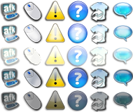
A toolbar image is a grid of button images stored as a windows bitmap (BMP) in the /default/toolbars directory. Different toolbar images can be used to change the look of the toolbar buttons. Toolbar images are interchangeable (even those of different sizes) as long as the images convey the same meaning, and are arranged in the same order.
The toolbar image itself is divided into five rows, and any number of columns. The first column is always used for the dropdown menu button graphic. Each column represents a single button, and each row represents a different version of the button as follows:
Row 1: Image of button in its normal, unpressed state.
Row 2: Image of button pressed
Row 3: Image of button in its normal, unpressed state with mouseover.
Row 4: Image of button pressed, with mouseover
Row 5: Image of disabled button.
Here is an example toolbar image:
The buttons may be any size, but they must be square. The browser determines the button size by dividing the height of the toolbar by 5. The image above is 160 pixels height, so the browser will determine the button size to be 32 x 32. The width of the image is then divided by this number to determine the number of columns. The image above is 192 pixels wide, which tells the browser that there are a total of six columns available. These columns are numbered left-to-right, starting with zero for the first (the drop-down menu button image) column.
Toolbar Configuration
The toolbar layout is stored in the toolbar.cfg file in the /toolbars directory. This file tells what commands are available on the toolbar, and what images those commands should use. Each line in the file represents one button. The line should contain the command the button performs, followed by the column number of the toolbar image to use for that button, followed (optionally) by the message number from the message set to be used as a tooltip. For a complete list of available commands see below.
Here is an example toolbar file.
   back 3 forward 2 none 0 look_up 8 look_level 10 look_down 9 none 0 first_person 11 third_person 12
   none 0 camera_front 51 camera_chase 50 none 0 mouse_move 61 afk 60
Any button which is not not associated with a valid command will act as a spacer. A spacer will only use the image from row zero (Unpressed) and will not respond to user input.
Toolbar Commands
Each button can be assigned one of the following commands:
exit forward back home teleport_set_home remember look_up look_down look_level first_person third_person world_features world_rights world_ejections show_downloads show_tabs show_gestures show_web show_whisper show_cell_grid login_citizen login_tourist privileges web_back web_forward web_stop web_refresh help about options_controls camera_locked camera_chase camera_front contacts_tab worlds_tab users_tab telegrams_tab teleports_tab help_tab search_tab afk mouse_move sdk_event
The command "sdk_event" is a special command which requires further elaboration. In the toolbar config, you may assign any number of buttons to this action in the following format:
sdk_event <image_number> <message_number> <id_number>
As with other commands, image_number and message_number specify what toolbar button image and message set entry to use for the button. For sdk_event, all fields must be specified, even message number. Additionally, an sdk_event button must be assigned a message id. This can be any number between 0 and 32767. When the user presses this button, a message is sent to the world server along with the given id, which is in turn sent to all bots with caretaker status. In this way a bot can be written than can react to toolbar buttons to perform various game-type functions such as "attack" or "show inventory". This provides another way for the user to interact with game-style worlds.
Note that this command is meaningless unless used with a world configured to handle these special commands. This feature requires the 3.5 versions of the world server and SDK.
In the SDK
Simulating Clicks
The SDK may simulate toolbar clicks with the aw_toolbar_click method. It can also receive clicks with the AW_EVENT_TOOLBAR_CLICK event.
Simulate toolbar #10 click.
void handle_toolbar_click (void)
{
  printf ("Session #%d clicked toolbar #%d\n",
          aw_int (AW_TOOLBAR_SESSION),
          aw_int (AW_TOOLBAR_ID));
}

aw_event_set (AW_EVENT_TOOLBAR_CLICK, handle_toolbar_click);
aw_int_set (AW_TOOLBAR_ID, 10);
aw_toolbar_click ();
Location
- Toolbars images are located in Default/Toolbars/ .
See also
- [1] - The toolbar.cfg file documentation.
